Advantages of Responsive Web Design – Well, what do you understand, when you say that a website is created using a responsive web design?
The answer is this:
When you say that a site is created using an interactive web design, it simply means it is easily able to adapt itself or integrate itself to any screen it is being used on, irrespective of the type of device the screen is captured into.
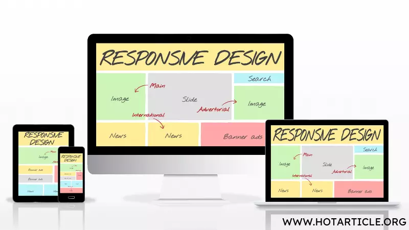
Whether you use your desktop, laptops or interactive smart phones, the site is automatically able to re-format itself in such a way that it gives the end-users a seamless experience. You can also create your site in such a way that it operates in sync with Google recommendations.
Advantages of Responsive Web Design
Let us go about unveiling each and every aspect on how one can go about making the site responsive, user friendly and an interactive one as well.
Adaptability For Mobile Design
The first step towards creating a site that is user-friendly or has an inbuilt responsive web design is that it should be able to re-format itself easily across smart phones or mobile phones. More than 40% of the people staying around the globe stay tuned to their mobile phones for at least two hours in a day.
They use mobile phones for checking e-mails, responding to messages on social media sites, perform online shopping and resort to paying their bills or mobile payments across online portals. Hence a site has to be customized in such a way that an end-user is able to easily navigate or toggle across icons while using mobile or smart phones.
Google’s Recommendations
Google strongly recommends that websites should be created by using effective protocols as stated by interactive or responsive web designers around the world. A site that uses a responsive web design is ranked top most in Google rankings.
The site can also be rewarded by Google Inc., if it is most adaptable while using across mobile platforms. The smart phone user must feel absolutely comfortable going through the website while the smart phone is on. Hence a site that is fully optimized for mobile platforms and user friendly is the site that top’s Google or other search engines.
The site also needs to have the content enriched with key words or SEO. SEO stands for Search Engine Optimization. You can search for the right SEO terms while curating the content for your site.
Core Advantages of Using a Responsive Web Design
1.While using a web responsive site, you find that the content and pages are automatically flexible for you to go through.
2. The site remains fluid across all forms of screen resolutions.
3. A responsive web design facilitates easy navigation across the site whether you use it on your laptop, desktop or mobile tablets.
4. Owing to the versatility of your website, more and more users will feel encouraged to visit your site. Your sales turnover improves if you are having an online franchisee or store.
5. SEO campaigns are easier to manage and you can facilitate webinars or online forums in a seamless and a hassle free manner.
Now that we have learnt the meaning, methodology involved and benefits of using a web responsive site, it is time you create one for your business or services.